Lucy Education Center is an English communication center for children. Not only teaching English, Lucy also organizes many outdoor activities such as sightseeing and picnics with the aim of encouraging children to develop language skills and love of English in the process of exploring the world around. Even Lucy's brand identity has shown this noble goal.
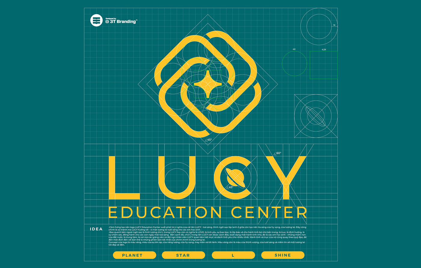
Interwoven with the letter "L", the logo of Lucy Education Center creates the image of an impressive flower with the desire to convey the meaning of cohesion in Lucy's learning community. The letter "L" is also the first letter of the word "Love" - love, showing the center's interest in the development of children. The pistil inside the flower is designed like a sparkling star, which means creativity, discovery and individual potential. Moreover, it symbolizes the outstanding growth that Lucy hopes to bring to her students.
The letter "C" in Lucy Education Center stands for "Change". The stylized letter "C" creates the symbol of a miniature universe, representing the sufficiency and continuous change in the learning process at Lucy. This is a reminder that students and parents will experience constant growth and progress in a challenging and full of opportunities learning environment.
Lucy's identity uses 2 main colors: green and yellow. Green represents creativity and youth while yellow represents discovery, joy and optimism. The combination of these two colors creates a positive and dynamic atmosphere at Lucy's learning center.